Website contact methods are not equal
For many businesses, the question of how customers get in touch has remained unchanged for years. A contact form, a phone number, perhaps an email address. Job done.
In reality, how a website allows customers to engage, enquire, or procure services has a direct impact on lead quality, conversion rates, operational workload, and scalability.
Not all contact methods are equal. There is a clear hierarchy, and the most effective websites are designed to guide users towards the most efficient outcomes.
The problem with treating all enquiries the same
When every visitor is funnelled towards the same contact form or phone number, several issues appear:
- High volumes of low intent enquiries
- Repetitive back and forth communication
- Time spent qualifying leads manually
- Delays between interest and action
- Friction for customers who want clarity quickly
These issues are rarely caused by demand. They are caused by how engagement is structured.
High performing websites solve this by offering multiple engagement paths, but doing so intentionally and hierarchically.
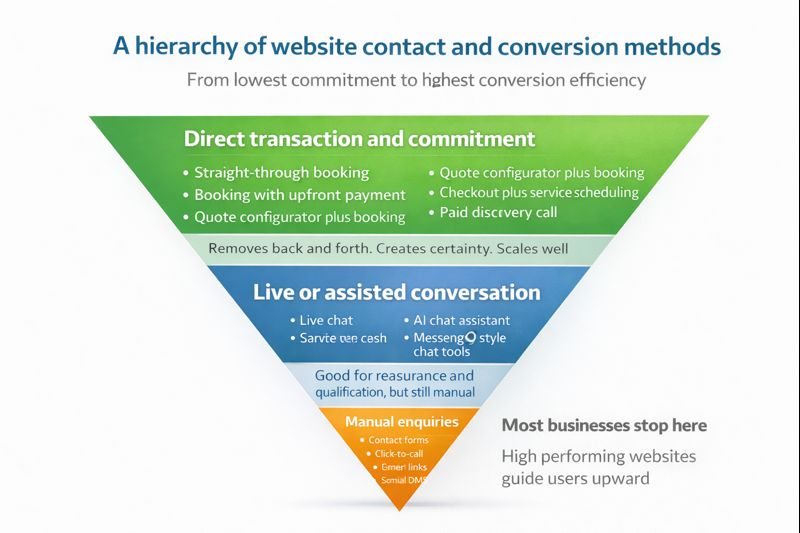
A hierarchy of website contact and conversion methods
Website engagement methods naturally fall into three tiers, based on commitment, friction, and efficiency.
Tier 1: Direct transaction and commitment
This is the most effective tier, and the one most businesses under utilise.
Examples include:
- Straight through booking
- Booking with upfront payment
- Quote configurator plus booking
- Checkout plus service scheduling
- Paid discovery or consultation calls
These methods remove uncertainty. The visitor knows what happens next, the business knows the level of intent, and the process requires minimal follow up.
From an operational perspective, this tier:
- Reduces admin
- Improves lead quality
- Creates predictable workflows
- Scales without adding headcount
From a customer perspective, it offers clarity and momentum.
Tier 2: Live or assisted conversation
This tier is interactive and reassuring, but still manual.
Examples include:
- Live chat
- AI chat assistants
- WhatsApp click to chat
- Messenger style chat tools
These methods are useful when a visitor needs reassurance, has a specific question, or is not yet ready to commit.
They perform best when used as a stepping stone upwards, not as the final destination. Without clear pathways to booking or payment, chat tools often become another inbox to manage.
Tier 3: Manual enquiries
This is the lowest commitment and highest friction tier.
Examples include:
- Contact forms
- Click to call
- Email links
- Social media direct messages
These methods are still necessary, but they should not be the primary focus of a modern website.
Manual enquiries:
- Delay decision making
- Increase back and forth
- Require manual qualification
- Create unpredictable workloads
Most businesses stop here, often without realising that better options exist further up the hierarchy.
Why high performing websites guide users upward
The most effective websites do not remove choice. They provide structure.
They make the most efficient option the easiest one to take, while still supporting users who need reassurance or flexibility.
This approach leads to:
- Fewer but higher quality enquiries
- Faster conversion cycles
- Better customer experience
- Reduced operational pressure
- Clearer alignment between marketing and delivery
It is not about forcing users. It is about designing for intent.
What this means for your website
If your website relies heavily on contact forms or phone calls, it is worth asking:
- Are visitors being given a clear next step?
- Are high intent users able to act immediately?
- Is your website reducing work or creating more of it?
- Could some enquiries be pre qualified or automated?
In many cases, small structural changes deliver disproportionate results.
Designing websites that convert, not just inform
At Macmillan Digital Services, websites are designed with conversion pathways in mind, not just visual appeal.
This means:
- Mapping services to appropriate engagement tiers
- Implementing booking and payment flows where appropriate
- Using chat tools strategically, not passively
- Reducing reliance on manual enquiries
- Designing for clarity, efficiency, and scalability
A website should do more than look professional. It should actively support how your business operates.
Next steps
If you are unsure whether your website is guiding users towards the most effective engagement methods, a review is often the best place to start.
👉 Book a Discovery Call to find out more about conversion focused web design and optimisation.
Macmillan Digital Services Blog